
 Is your website easy to navigate? Does it convey trust and credibility? Would I know what to do when landing on your home page? These are just a few of the questions to be asking if you want your website to be optimized for the almighty conversion! From the design of your website navigation to the content on your pages, we’ll be discussing some of the key elements of conversion rate optimization today!
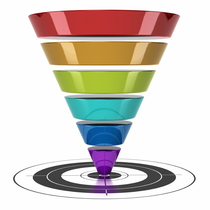
What are Website Conversions?
Conversions occur whenever a website visitors performs an action on your website that is directly related to your business goals.
In the hotel industry, for example, a conversion might be every time a visitor makes a reservation. 
From a measurement perspective, your website’s conversion rate is the percentage of visitors who completed a goal divided by the total number of visitors.
A website without conversion rate optimization is like a car without wheels- it will take you nowhere.
Fortunately, there are a lot of ways to increase your website conversions- from adding compelling calls-to-action to smoothing out your website forms. Let’s add some fuel to your website and open the gates to higher conversions!
Bold Calls-to-Action
Calls-to-action (CTAs) tell people to do something that will help them complete a goal. These are a gift to both website owners and visitors alike, as calls-to-action guide visitors to take meaningful action on your website. Calls-to-action can vary by industry, and will be specific to your objectives.
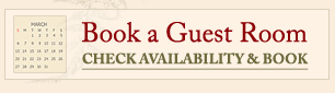
Let’s take a quick example. When people land on a hotel or resort website, their goal will likely be to place a reservation. An example of a call-to-action on a hotel website, then, would be “Book your Stay Today.”
Because a website visitor can have many different goals, it is important to emphasize your 2-3 most important calls-to-action on the home page. Use specific colors and font sizes the tell visitors which calls-to-action are most important. This way, it’s clear what you want people to do once they have arrived to your site!
Simple Sign-Up Forms
We typically see forms on a website when making a reservation, subscribing to a newsletter, or perhaps signing up for a product demo. Forms are a great way to capture people’s information and better understand a buyer person (in other words, a profile of your target customer). Like any other feature on your website, forms can have a major impact your conversion.
When a person arrives on a page with a form they see this as a stepping stone to getting what they want (whether it is a booking confirmation page, a free whitepaper or scheduling a demo). Regardless of the goal, people want to complete this step as quickly as possible and get what they were promised.
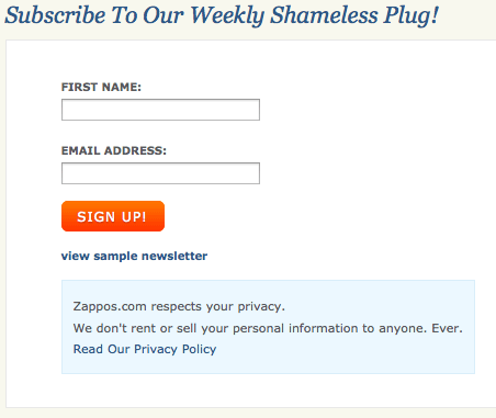
The longer the form, the less time we spend thinking about the end-goal. Forms should be short and to this point, as shown in the example above from Zappos. This keeps visitors engaged and focused on the goal. Collect only the most critical information needed to contact your visitor, and then ask for the detailed information once you have them them on the phone.
Prominent Trust Symbols
Trust is a significant factor on the web- if I’m giving out my personal information, it’s important to know upfront that the site is focused on privacy and security. And how can I tell if this a priority? Trust symbols.
If your website uses forms to collect visitors’ personal information, be sure to include a privacy statement on or around the sign-up form. We often see these statements on forms for newsletter sign-ups, whitepaper downloads, or requesting a demo.
Another example of a trust symbol is the credit card acceptance icons. Trust symbols such as major credit card acceptance icons minimize fear and uncertainty. Not only does it relieve anxiety, but this little icon can save visitors critical time from having to search around the site to find what credit cards your business accepts!
Testimonials are also great for instilling trust in your product or service. Think about it- if you visit a hotel’s website for the first time yet know nothing about them, how would you know if their rooms and amenities were any good? You wouldn’t.
This is where testimonials can help relieve the uncertainty factor that first time visitors experience. Whether you add a new page to your website dedicated to testimonials or simply have them rotating across the website, these little snippets of text can add tremendous value to your credibility.
Easily Accessible Blogs, Whitepapers, and other Helpful Resources
“Content is king” has been a popular mantra lately. Why? Because quality content on your website provides two incredible benefits to businesses.
- First, people love to get free information. Information helps us make faster, more confident decisions and move closer to taking meaningful actions. If you can share information with your visitors in the form of high quality blog posts, whitepapers, and case studies, your visitors will be more likely to listen. And while the information may be free to your visitors, the payoff comes when they sign-up for a product demo or buy your product!
- The second benefit is a boost to your search engine optimization strategy. By adding fresh and unique content to your website, you are showing search engines that your website is actively being updated. Not only is it being updated, but you’ll be adding relevant keywords to your site in the process (which can improve your rankings on search engines!).
I’m not keeping score, but this is a win-win scenario. Your customers are happy (now that they have some genuine, honest, and jaw-dropping free information), and you are happy (as your site gains a competitive advantage over your keyword competitors).
Conversion Optimization Checklist: How Does Your Website Measure Up?
If your website means anything to your business, take 5 minutes to compare your website to the conversion rate optimization factors discussed above.
Does your site measure up? Are there areas for improvement?
Remember- conversion rate optimization is a never-ending process. If you want more customers, you must keep your website up-to-date with these best practices. And when you’re ready to improve your website’s conversion rate, contact Mannix Marketing for a free website review and strategy session!