
Of the many website design and development trends affecting businesses large and small, one of the most enduring has been sliders. While fairly common, these large, rotating images can actually be bad for SEO and user-experience alike. Why should you reconsider the use of a slider on your company’s website, and what are some alternatives to sliders?
The Problem with Sliders (Slideshows, Carousels)
Most businesses get excited when people come to their website. It’s an opportunity to tell potential customers about their products and services, so they want these visitors to be engaged. The solution, many believe, is to cram a bunch of messages into a set of rotating slides across the top of the website in hopes that visitors will see this content.
In reality, studies have shown that visitors rarely click on subsequent slides, and this may be a result of visitors’ growing impatience in a world of instant gratification. People are generally becoming more impatient when they go online, so the fact that most people move on before a new slide has time to be displayed should surprise no one.
Speaking of time, sliders can have a negative impact on your website load speed. It takes more time to load a page with more images, so the longer the load time, the longer you’re forced to wait. Would you stay on a slow-loading website if you could simply go to another website, instead? If you answered ‘no,’ like most people, then why would your visitors be any different?
To make matters worse, this slow-loading feature can also be harmful to your SEO. Because Google has been using site speed as part of its ranking algorithm for many years, a bloated website can make it harder for your business to climb to the top of the search engine results.
Alternatives to Website Sliders
As sliders fade out of style, what options are available to engage potential customers when they land on your website home page?
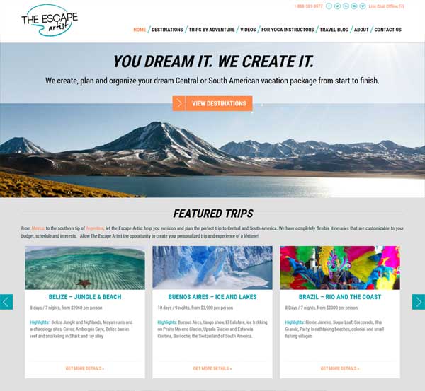
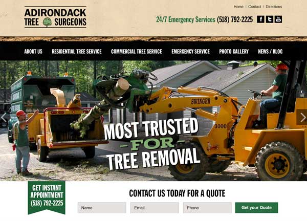
1. Hero Images
A hero image is a static, full-width image that spans the upper part of your home page and visually conveys your main message. In addition to displaying a strong headline message, including a strong call-to-action that tells visitors what they should do now provides a clear next step that can help remove the guess work from the equation (while showing visitors you understand the problem they’re trying to solve by visiting your website).
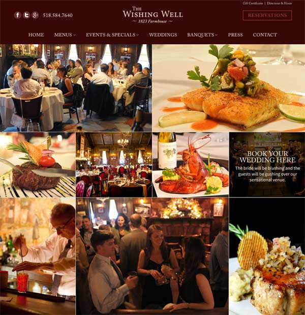
2. The Collage
The collage is a combination of visual offers (each with it’s own call-to-action) designed to entice visitors to dive deeper into your website. Each offer appeals to a different type of audience based on their needs, which can help you speak to multiple personas from the get-go. If you feel like your hero image or message is too limiting, then the collage might be a great solution for casting a wider net.
3. Lead Generation Form
A lead generation form encourages visitors to provide their contact information or other important details so that they can get something from you in return. Whether these visitors are requesting more information about your services, making a reservation, or downloading a special offer (such as an eBook or buyer’s guide), this form can help guide them through the buying process/funnel.
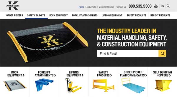
4. Search Form
Search forms are often seen on websites that have a lot of products (think e-commerce businesses) or items (think real estate companies) which can be filtered based on a visitor’s needs. While visitors can browse through every single item on the website, an easy-to-use search form simplifies the process by letting them search for the items that match their criteria.
Conclusion
For the reasons discussed above, we usually don’t recommend using sliders on websites. That being said, there are certain situations where it does make sense to use a slider. A hotel that wants to promote a last-minute special, for example, might have a slide to highlight the offer, followed by another slide which tells a story about the guest experience.
Having an easy-to-use, SEO-friendly website is one of many ways businesses can grow their visibility, traffic, and leads. If you’d like to learn how we can help your business through website design and development and related marketing services, please contact Mannix Marketing today!